After my previous critique group disbanded, I began a search for some fellow MG writers to give my manuscripts one more look through. It didn’t take long to find three ladies desperately seeking (my words, not theirs) an MG writer.
I wasn’t sure at first since they were an Adult, YA, and a Picture Book writer, all sporting new works ready to be critiqued: A 120,000 word Historical Fiction, two separate YA contemporary offerings, and two picture books. They’d been together for several years and preferred having the various levels in their group to get a broader scope of opinions. I went ahead and signed on as the newbie.
They are spread around the country so my monthly writer’s group meeting (with to die for snacks) is no more. Anyway, I couldn’t wait to get started and send the first chapters of two stories that have been revised again, but it seems like the final push as they’ve been critiqued to the max. My instructions came the next day with directions to send a sample book cover for each story. Huh? Was I in the wrong group?
I soon found out this was how they start their critique process, to see how you might interpret a front cover for your story. “Interesting,” I said. “I’ll get back to you on that one.”
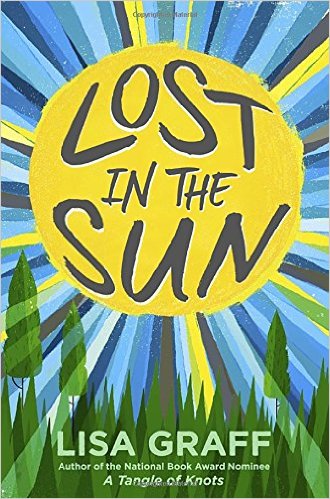
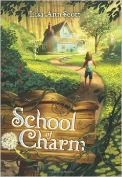
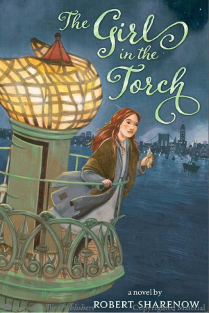
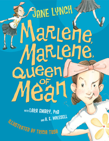
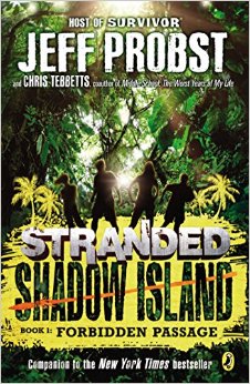
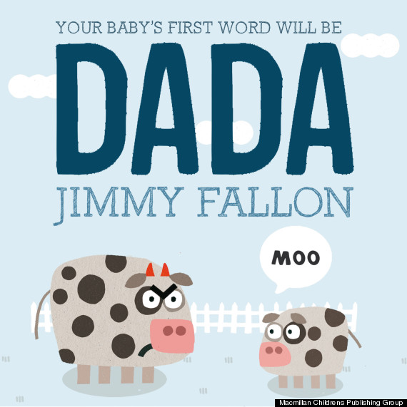
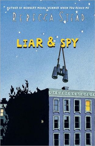
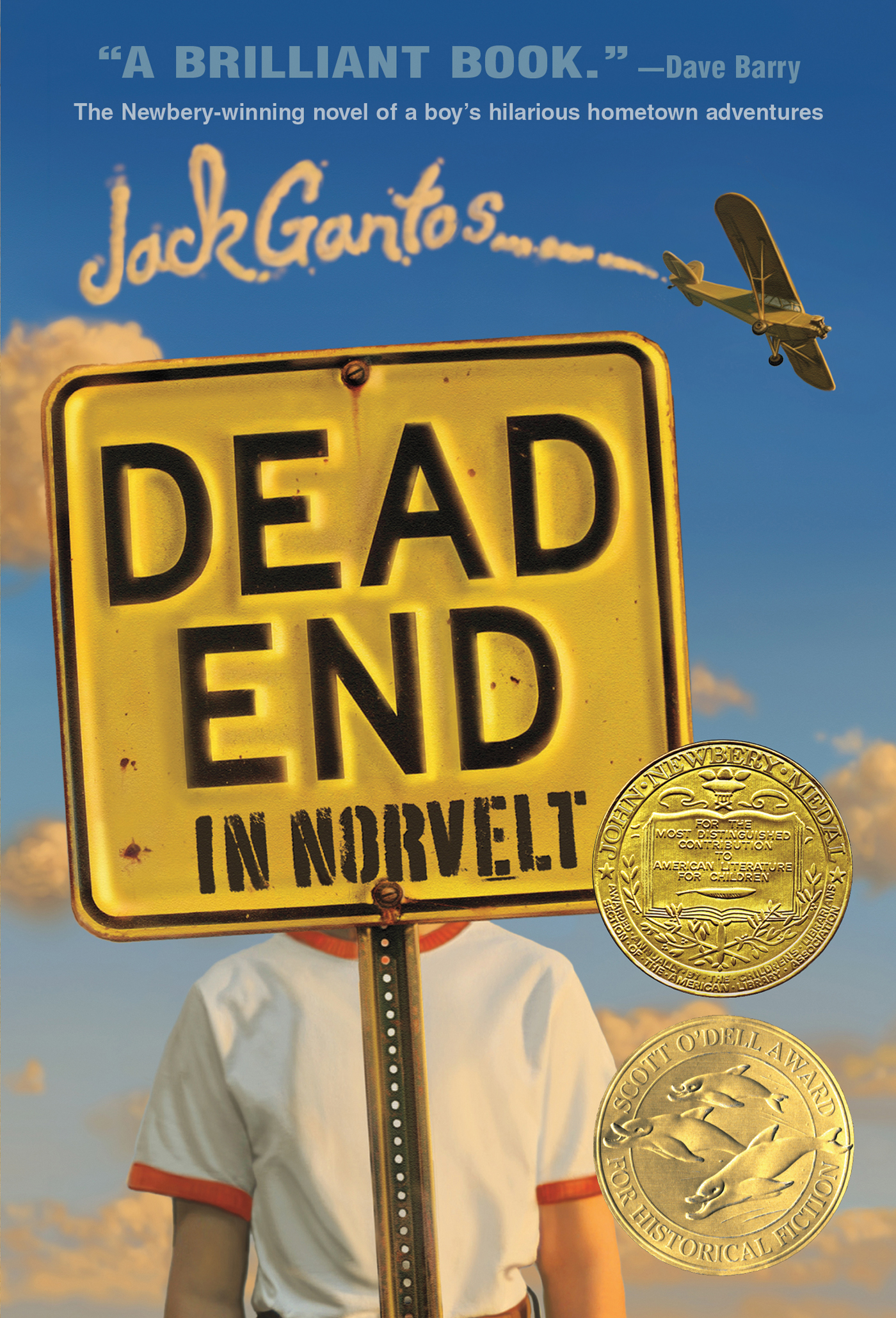
I thought about book covers I adore, mostly the simple ones that provide just a hint as to what lies ahead. I don’t like dark covers where details are hard to decipher or busy covers with so much going on my head is spinning. I sifted through some of my favorites:
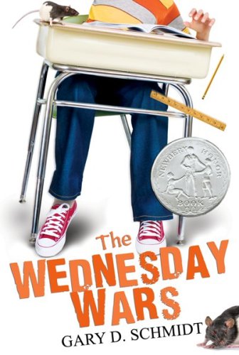
- THE WEDNESDAY WARS provides a window to the main character with his desk slightly tilted. And what’s with the rodent? This one grabbed me right away.
- LIAR AND SPY is a simple cover that says a lot. The title of course, but also the calming blue colors with the one light shining in the top room. So intriguing.
- DEAD END IN NORVELT is sadly hilarious. The boy’s head covered by the dead end sign, and how will that plane be a part of the story?
So I went to work on my first cover. It was rather an amazing process, thinking about my story as a whole and trying to capture a new reader’s attention in a single cover. It also made the story feel more complete. I could see this taking a good portion of August so I kept it simple. I’m just glad I don’t design book covers for a living. I’ll stick to writing and leave the covers to professionals.